Dev Log #3 Production
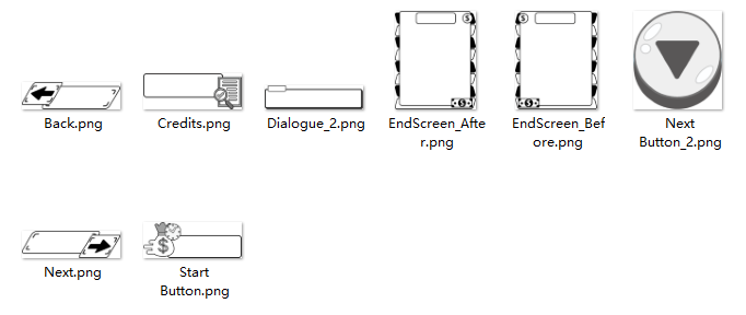
I was still in charge of my duties as a UI designer and project designer when the overall progress of the project team reached a late stage. After helping the team design the financial reporting UI for the end screen and the UI for the start screen, I realized a problem. At the very beginning of the UI concept design stage, my idea was to make the UI more interesting and distinctive, so I would look for references of UI designs with different design styles and colour aesthetics. However, because of the excessive number of art assets and the fact that we had two art designers in the group, it was impossible to unify and combine the art styles and colours with each other. So I had to choose to abandon the initial idea and choose to adjust all the UI design colours of the game to black and white grey. This simple grayscale colour can easily combine with the background and work well. It also guides the player to notice the game's background and the game's character dialogue while playing. It gives a more immersive gameplay experience.

In the third playtest, the main purpose of our playtest was to re-examine the image of each game character and the communication of the game's core content. In the results, we were surprisingly pleased with the majority of the testers. However, we still need to finish the last phase of the game before the end of the semester to review all parts of the game and make sure that the game script, audio and art assets are working properly. If we have enough time, the team may be able to refine the gameplay experience for players.
Rat Race
| Status | Released |
| Author | Junhe Chen |
More posts
- Dev Log #2 ProductionFeb 21, 2023
- Dev Log #1 Pre-ProductionJan 19, 2023
- Devlog 4 - Learning ReflectionDec 03, 2022
- Devlog 2Oct 21, 2022
- Devlog 1Oct 05, 2022
Leave a comment
Log in with itch.io to leave a comment.